I’m a crypto product designer with a marketing background in consumer brands and web3 startups. I am not an expert, but I have a really curious mind. I ask a lot of questions around the problem we are trying to solve. I believe this approach has helped me exceed user expectations and drive positive brand impact in my previous roles.

Design System

In 2021, I launched my product design journey at Coinvise by developing the brand guidelines and a comprehensive design system for their web application. I meticulously established the design system's core elements, from typography styles and color palettes to padding and corner rounding values. This comprehensive system, provided a foundation for a consistent and scalable user experience.
I feel Design systems are living documents, not static style guides. Through continuous design optimisation, the addition of new elements and components, they stay relevant and responsive to evolving needs.
Dashboard Design
Once we had the fundamentals of Design System in place, my first design job was to revamp the Coinvise Dashboard. At the time, Coinvise offered a robust suite of tools for managing community tokens and incentives. However, as community needs evolved and the crypto landscape shifted, Coinvise proactively pivoted its product offerings to stay relevant.


Campaign Page Design
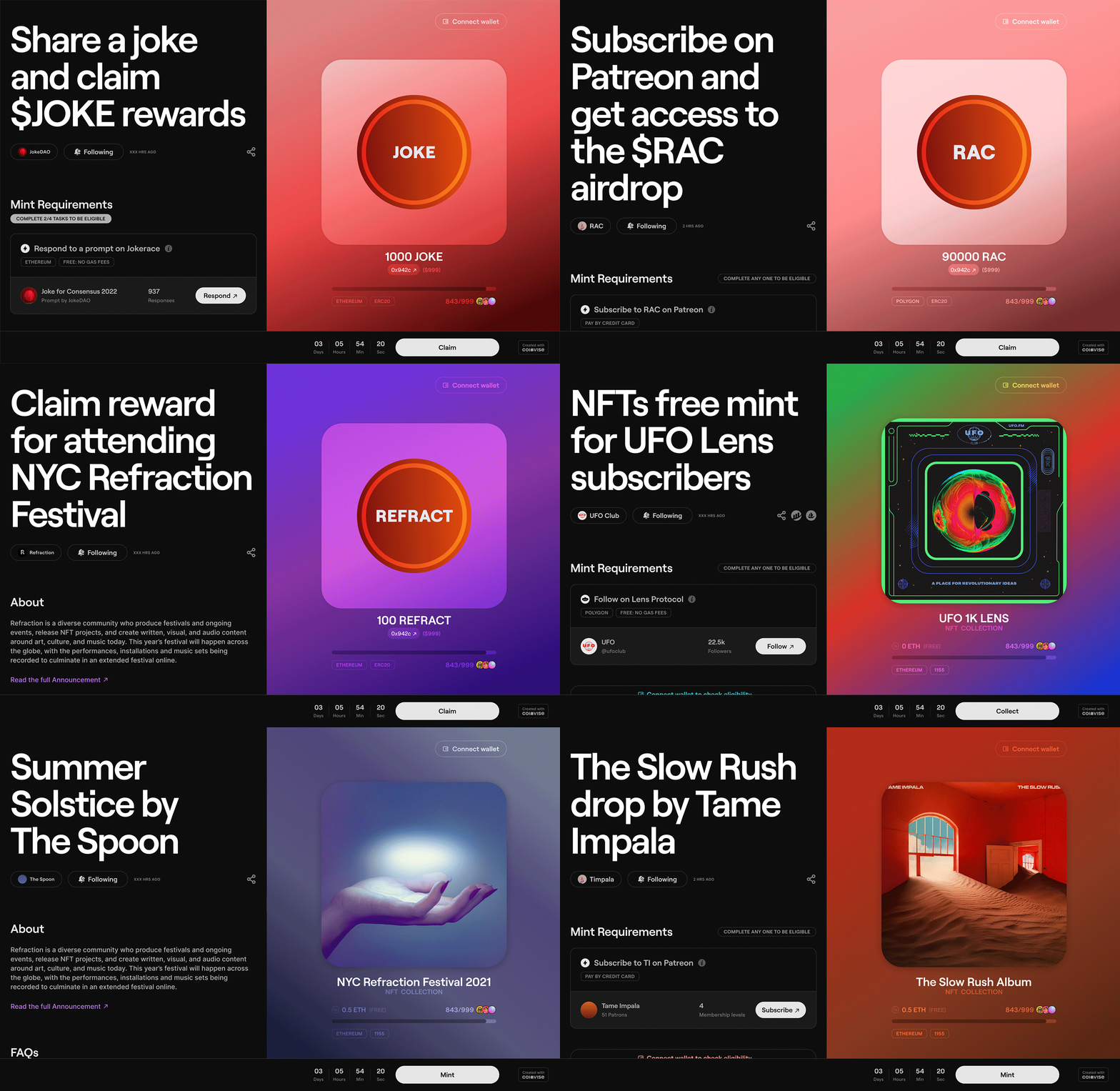
Once the team realised Campaigns is the product-market fit for Coinvise, it was time to revamp our claim page designs. I redesigned the campaign creation flow and the claim pages to meet the growing user demands.

We introduced setting claim Requirements which the user has to complete in order to be eligible for claiming the asset (token/NFT). These requirements could be as simple as provide your email id, to complex tasks such as follow on Farcaster/ Lens/ Orb/Twitter, provide Uniswap liquidity, hold a token/NFT, join Discord, collect NFT on Zora/Sound/Mirror etc.

https://x.com/CoinviseCo/status/1669416551102173184/photo/1
We also introduced setting Campaign Perks to the users who’re eligible for the claim. In addition to the token/NFT, now the creator can also reward the user on successful completion of the campaign. The perks could range from access to unique content to communities on Discord/Telegram, exclusive merch, event tickets and subscriptions. These rewards could be distributed via two methods: enable to all or, to selected winners through a raffle draw.

https://x.com/CoinviseCo/status/1740047358258520410/photo/1
The new claim page design is based on the following strengths:
-
Storytelling: Leveraging storytelling is a great way to engage users and create an emotional connection with the campaign. This can lead to a deeper understanding and potentially higher claim rates.
-
Requirement & Perks: Providing clear information about the requirements to participate and the benefits of claiming tokens streamlines the process and incentivizes users.
-
Six Prominent Sections: Having a well-structured page with dedicated sections guides creators through the campaign setup process and ensures clarity.
The new Campaign page design divided the UI into two parts: The left part is scrollable and is dedicated to the storytelling, requirements, perks and FAQs. The right side of the page is fixed (no scroll) and has space for the NFT/token details, and a clear button with the CTA- Collect, prompting users to claim tokens or participate in the campaign. The new design stood out coz of two reasons:
-
Clear Separation: Dividing the page into a dedicated storytelling/information section and a fixed action section creates a clear hierarchy and guides users effectively.
-
Focus on Action: Having the NFT/token and the CTA button on the right side, fixed and readily visible, keeps the action at the forefront and encourages participation.
Campaign page demo:
I also designed custom Campaign pages for ecosystem clients, e.g. AISC Summer Campaign, Polygon Social Switch, Arbitrum Amplified and Base Spotlight.
After completing the initial design, I took the initiative to further refine the campaign page aesthetics with an eye towards the future updates. Inspired by the iOS album art background effect, I conceptualised a design upgrade that I believe enhances the overall appeal and longevity of the page. I'd be happy to hear your thoughts and get some feedback on this new direction.
Campaign Templates Design
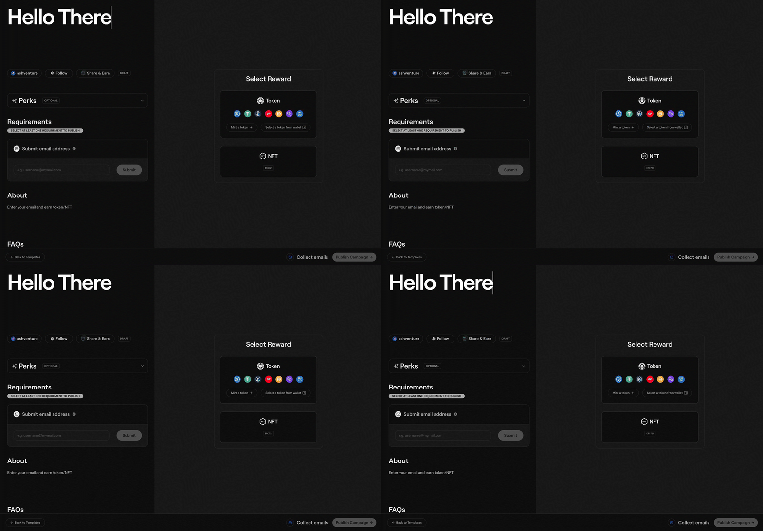
We made the Campaign creation process even simpler by introducing Campaign Templates. While retaining the original flow, we introduced four new templates with preselected requirements:
-
Follow on Socials (Twitter/Farcaster/Lens)
-
Join our Community (Discord/Farcaster/Orb)
-
Collect Email
-
Share a Post (Twitter/Farcaster/Lens)

To further speed up the flow, I introduced WYSIWYG blog-like format which significantly improved the user experience and streamlined campaign creation for users. Here's how:
Benefits of WYSIWYG format:
-
Faster Creation: By eliminating forms and replacing them with editable sections, users can see their campaign page come together in real-time, accelerating the creation process.
-
Improved Visualisation: The WYSIWYG format allows users to visualise the final page layout as they add content, leading to better decision-making and a more cohesive campaign page.
-
Easier Editing: Editing text, images, and other elements within the page itself is intuitive and avoids the need to switch between forms and preview modes.
Using Popup Modals Effectively:
-
Focus on Specific Content: Popup modals for adding details like requirements, perks, and rewards keep the main page uncluttered and allow users to focus on specific content at a time.
-
Clarity and Organization: Each modal can be designed with clear labels and instructions to guide users through adding the necessary information. Consider using examples or templates for requirements and perks to assist users.
-
Saving and Previewing: Ensure users can save their progress and preview the entire campaign page before finalizing it. This allows them to catch any errors and make adjustments before publishing.
https://x.com/CoinviseCo/status/1778454758359253414/photo/1
Campaign Metrics Design
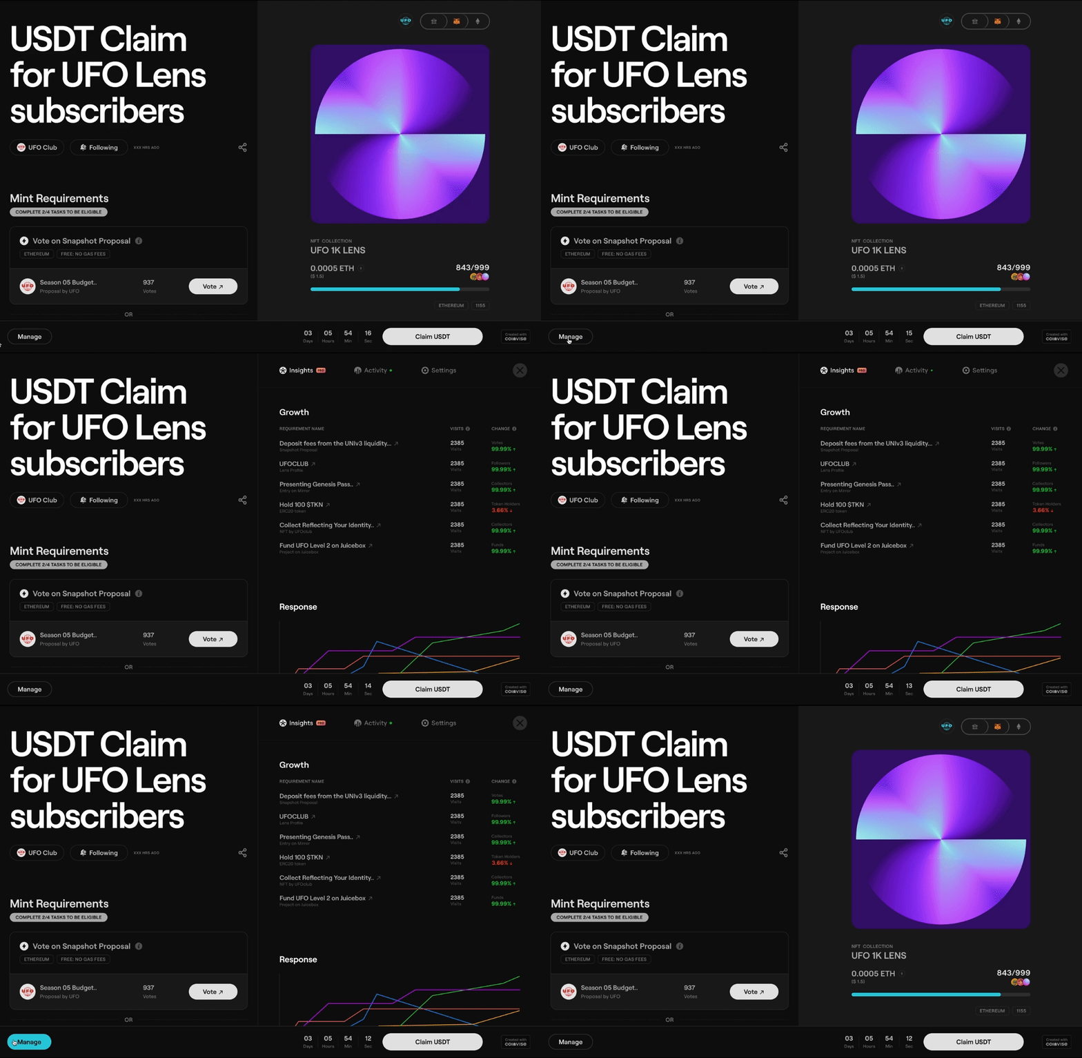
After launching the new Campaign page design, the next obvious step was to design for Campaign metrics. We introduced a Manage panel (visible only to the Creator) keeping these points in mind:
-
User-Centric Design: By creating a dedicated Manage panel with clear tabs, prioritize user needs and made campaign data readily accessible.
-
Actionable Information: The combination of real-time data, milestones, and campaign control options empowers Creators to take action and optimize their campaigns.
-
Flexibility and Control: The Settings tab provides a good range of options for Creators to manage their campaigns according to their specific needs and goals.
https://x.com/CoinviseCo/status/1677012370798018562/photo/1
We introduced three tabs in the Manage panel for very specific tasks:
-
Insights & Monitoring The Insights tab empowers Creators to track campaign performance in real-time, allowing them to optimize their strategies for better results.
-
Actionable Data The Activity tab with the live minting graph and milestones provides valuable data points like first/last mint, total minted tokens/NFTs, and unique minters (export as CSV). This allows Creators to gauge user interest and campaign effectiveness.
-
Campaign Control The Settings tab offers Creators flexibility by allowing them to pause/withdraw campaigns, generate embed URLs, set custom URLs, list campaigns on the Orb app, and customize accent colors.


https://x.com/CoinviseCo/status/1690022434055839744/photo/1
Protocol Rewards, XP & Streaks Design
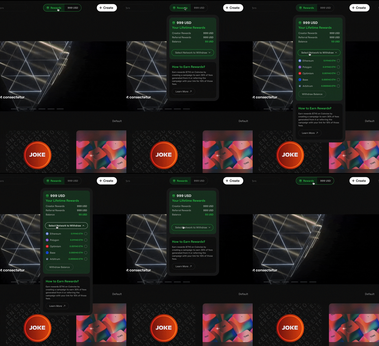
On 1st March, 2024 Coinvise introduced Protocol Rewards. With Protocol Rewards, both Creators and collectors can now earn rewards by using Coinvise. Creators can now earn 30% of the platform fees from their Campaigns on Coinvise. Collectors can earn 10% of the platform fees through unique referral links. I designed the Rewards UI by integrating the Rewards component in the page header design.

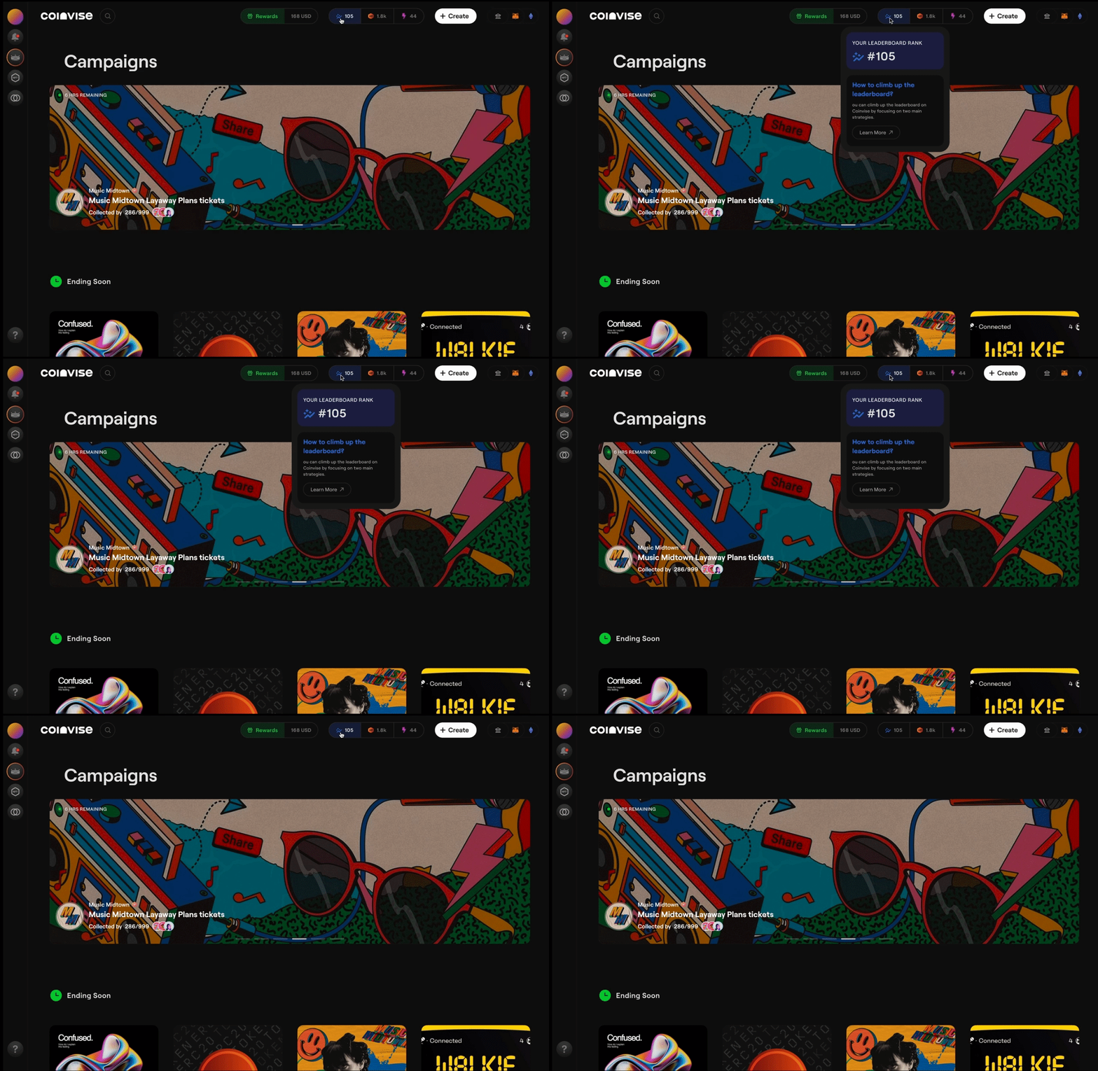
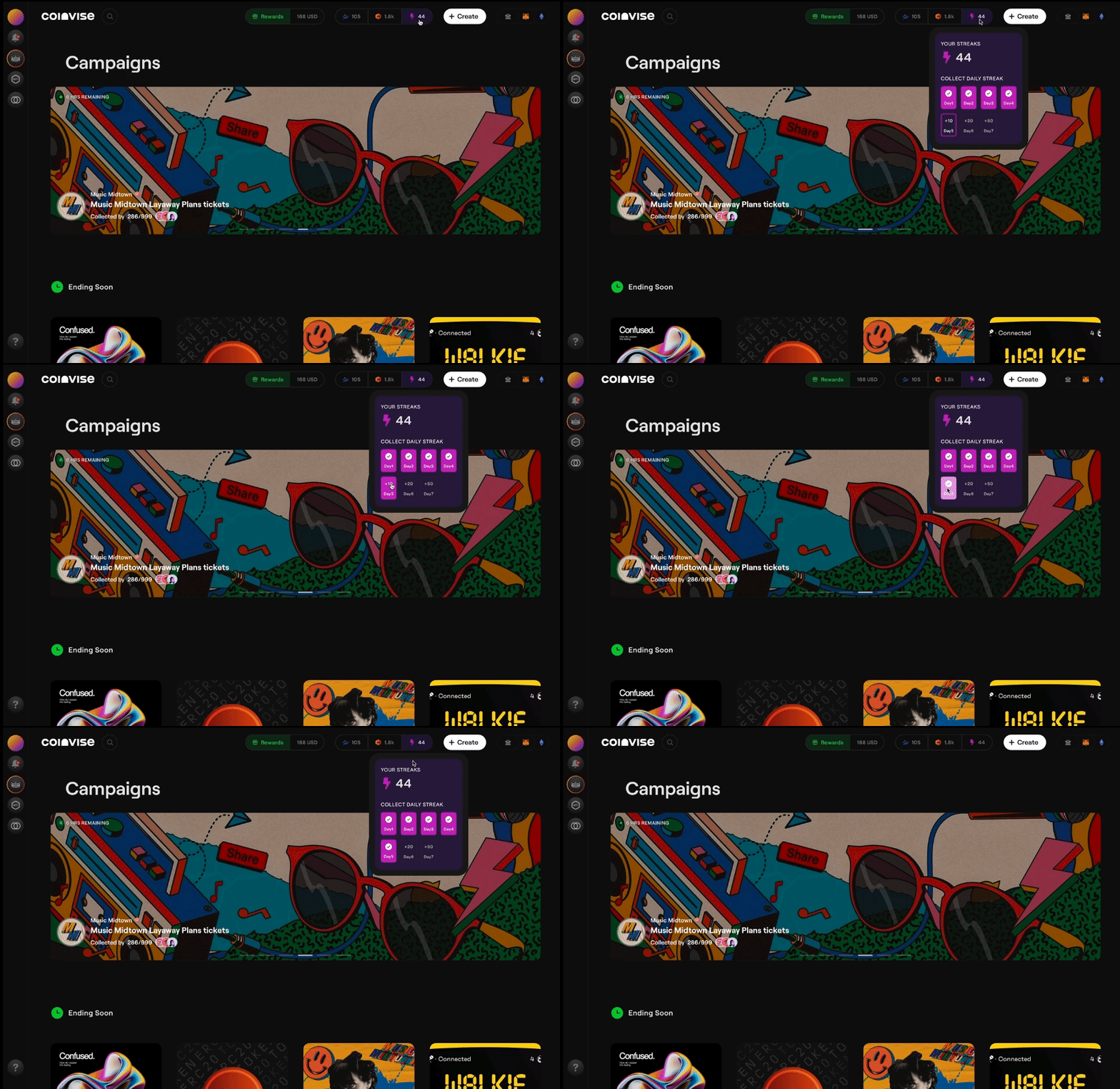
Subsequently, we also launched Leaderboard Ranking, XP awards and Daily Streaks. I designed the iconography, colors and the overall experience for all three components.
Overall Experience:
-
Integration: The Rewards, Ranks, XP and Streaks were seamlessly integrated into the Coinvise user experience. By placing these components in the header, they easy to access and always visible.
-
Engagement Loops: Components like Leaderboard Ranking, XP and Streaks were designed to create engagement loops, e.g. Streaks incentivised users to return regularly to the platform.
https://x.com/CoinviseCo/status/1782756313446961359/photo/1

On 1st March, 2024 Coinvise launched Protocol Rewards.
https://x.com/CoinviseCo/status/1763613941500887410
Within a month of launch, Creators reported earnings through Protocol Rewards.
https://x.com/gamiwtf/status/1787376878271250583
The new feature updates resulted in huge response from the Creator and Collectors.
https://x.com/0xjenil/status/1771785493174260146
https://x.com/0xjenil/status/1783852117884842312
The new features- Rank, XP and Streaks also found prominent place in the revamped Profile Page design.

Crosschain minting Design
With the launch of multiple L2 chains like Polygon, Optimism, Base, Arbitrum, Avalanche and Binance, collecting tokens/NFT Coinvise Campaigns became harder as most of the collectors did not hold any balances on the upcoming new chains. E.g. to mint on Polygon, the user needs to have MATIC balance to pay for the assets as well as for the gas fees accrued. This posed a serious problems for the new chains- how to get users to engage on new chains.
The rise of multiple L2 (Layer 2) chains like Polygon, Optimism, Base, Arbitrum, Avalanche and Binance presented a challenge for user engagement, especially for new chains. Here's a breakdown of the situation and some potential solutions:
The Challenge:
-
Lack of Native Tokens: Users might not hold any MATIC (Polygon) or other native tokens of the new L2 chains, making it difficult to participate in Campaigns and pay gas fees.
-
Unfamiliarity: Users might be unfamiliar with the new chains and hesitant to explore them.
-
Clunky Ux: To be able to participate in these Campaigns, users had to first bridge and then swap their balance into native tokens. This adds an unnecessary step in the entire minting experience.
In 2023, Decent launched The Box, thus solving the problem of crosschain minting on any chain, without holding any balance on the same chain. With Decent Box integration, users can mint from any chain and pay for the gas fees with any assets they hold in their wallet. It feels just like you’re interacting on a single chain.
In early 2024, Coinvise integrated the Decent Box SDK into its minting process. I designed the frontend for the seamless crosschain minting experience.
Key features of the Coinvise minting ux:
-
Smart Chain Selection: No more worrying about gas fees! The system automatically analyzes gas prices across different chains (e.g., Polygon, Optimism) and selects the most cost-effective option for minting.
-
Seamless Minting: With just one click on the "Sign" button, the Decent Box integration facilitates a smooth interaction between your wallet and the minting process.
-
Direct Mint Option: If you have sufficient balance on the native chain required for the specific campaign, the system bypasses Decent Box and utilizes the familiar direct mint interface. (This might involve switching the network to the NFT chain.)
-
Low Balance Alerts: In the rare case where you don't have enough balance on any supported chain, the system clearly informs you with a "low balance" message, so you can take necessary actions before attempting to mint.
These improvements ensured a more efficient, user-friendly, and cost-effective minting experience on Coinvise.
Beyond the above product designs, I also played a key role in designing earlier product flows. This included:
-
Engagement Features: Design of user journeys for quests, vesting/lockup schedules, and airdrop claim links.
-
Innovative Functionality: Creating a "wallet multidrop" feature that airdrops tokens to multiple wallets based on on-chain data filters and criteria.
-
User Experience: Designing intuitive navigation systems for both desktop (sidebar) and mobile (pull-up menus and side-scrolling).



评论 (0)