
In product design, the principle of "Don't Make Me Think" emphasizes that the best products are intuitive and require minimal effort to use. Users shouldn't have to wonder how to interact with a product; it should be natural and seamless. This philosophy is crucial, yet when it comes to Web3 and blockchain, we often fall short.
I've seen firsthand how challenging it can be to distill complex systems into intuitive experiences while working with drivers in ride-hailing quite often, users generally don’t care about your tech stack and the underlying challenge as long as they meet their goals. I believe deeply in design thinking and its power to solve real-world problems, and I think the Double Diamond model is the secret to solving all of life's problems. In fact, we are all designers; we apply design thinking all the time, in life, in our work, and if you’re an entrepreneur—your whole business. However, the current state of Web3 feels like sitting in a boiling pot - there's so much potential, but also a bit of pain to use in daily applications.
Initially, I believed that the solution was simply better design. While that's part of it, I've come to realize and appreciate that the root of the problem lies in the infrastructure itself. The user experience in Web3 is only as good as its underlying infrastructure. This insight led me to collaborate with my co-founder, Moughite. One of the first thing we did together, we conducted a workshop at a local Web3 event about Account and Network Abstraction in early 2023 before Chain Abstraction became widely discussed.

The reality is that interacting with Web3 often requires users to navigate complex processes just to set up a wallet or make a transaction. If you recall your first time creating a wallet, buying a token, or sending cryptocurrency, you know how daunting it can be.

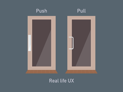
To achieve widespread adoption, we must stop making people think about how to use Web3 and instead let them simply use it. Good design is invisible—it guides users effortlessly without them realizing it. It speaks to your system 1 thinking (for those adept at Thinking Fast and Slow). Just like a well-designed door that intuitively indicates whether to push or pull, our products should be self-explanatory.
In 2022, I grew frustrated with the state of wallets. Despite improvements with account abstraction and increased attention to UX, no wallet truly adhered to the principles of good design. However, I now see the technical feasibility of creating a better experience, especially with the advanced in account and chain abstraction. I'd like to share a wallet design prototype I created in 2022 that remains relevant today.
Introducing the Abstracted Wallet: A Wallet That Doesn't Make You Think
My goal with this wallet design exploration was to:
-
Start from first principles: Question why things are done a certain way and consider the best approach without legacy constraints.
-
Remove networks from user choices: Networks should be a developer concern, not a user burden—hence, chain abstraction.
-
Avoid verbose wallet addresses: These are akin to IP addresses, they’re not memorable, not personal and made for machines, so instead default to user identity instead.
-
Expand wallet functionality: Wallets should be more than balance displays; they can hold IDs, cards, and NFTs representing various assets.
-
Good design is not when theres nothing left to add, its when there’s nothing left to remove.
When done right, wallets can offer a better experience than current financial apps like Revolut. Let’s dive in:
Home Screen
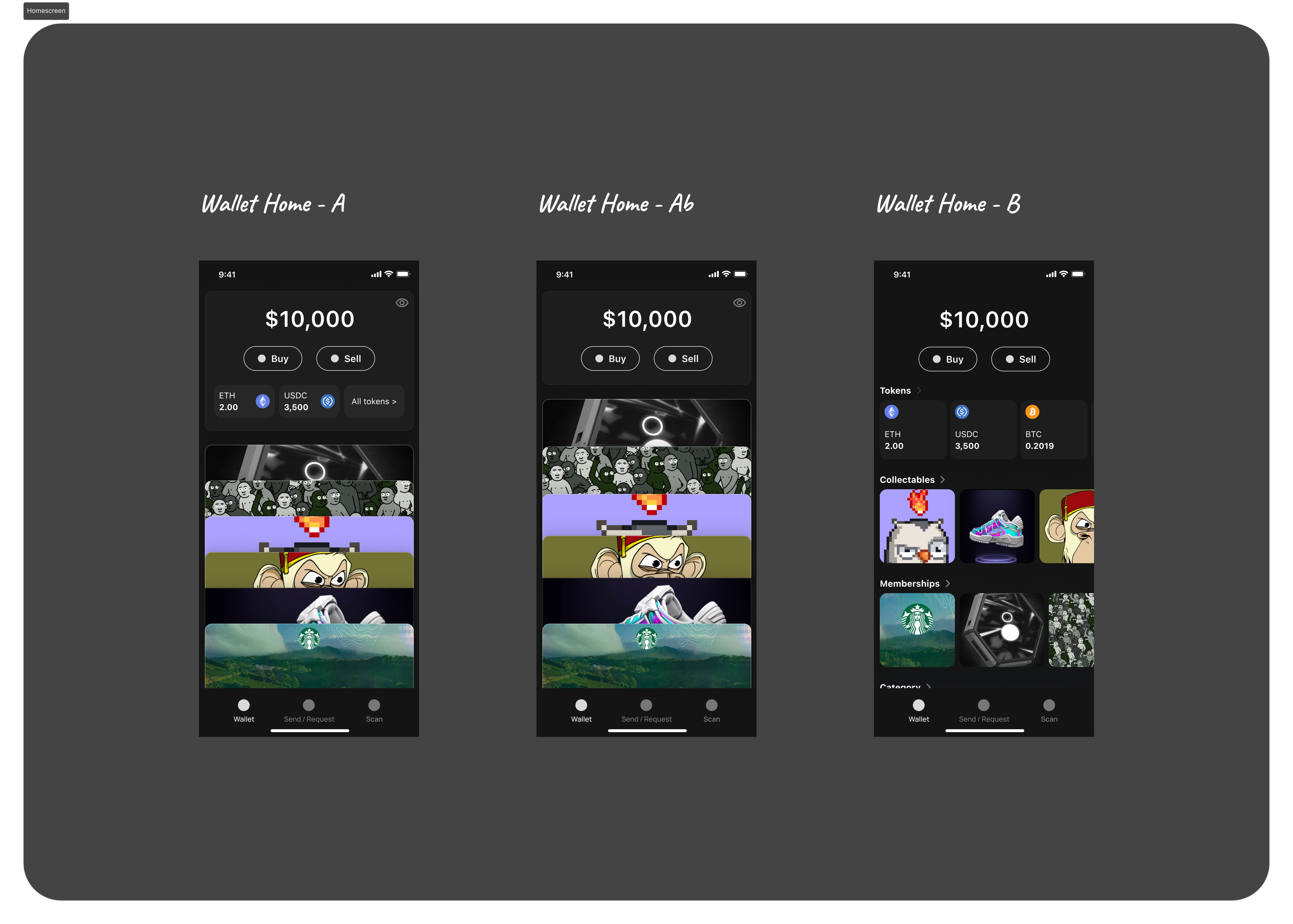
One Total Balance
The home screen displays your total balance, combining the value of all your tokens into one number.
NFT Ownerships
Imagine owning NFTs that represent a Starbucks membership card, a Nike shoe, or a flight ticket. Your wallet can hold these digital assets, displaying them like cards that adapt based on your location or usage patterns.
Buy and Sell
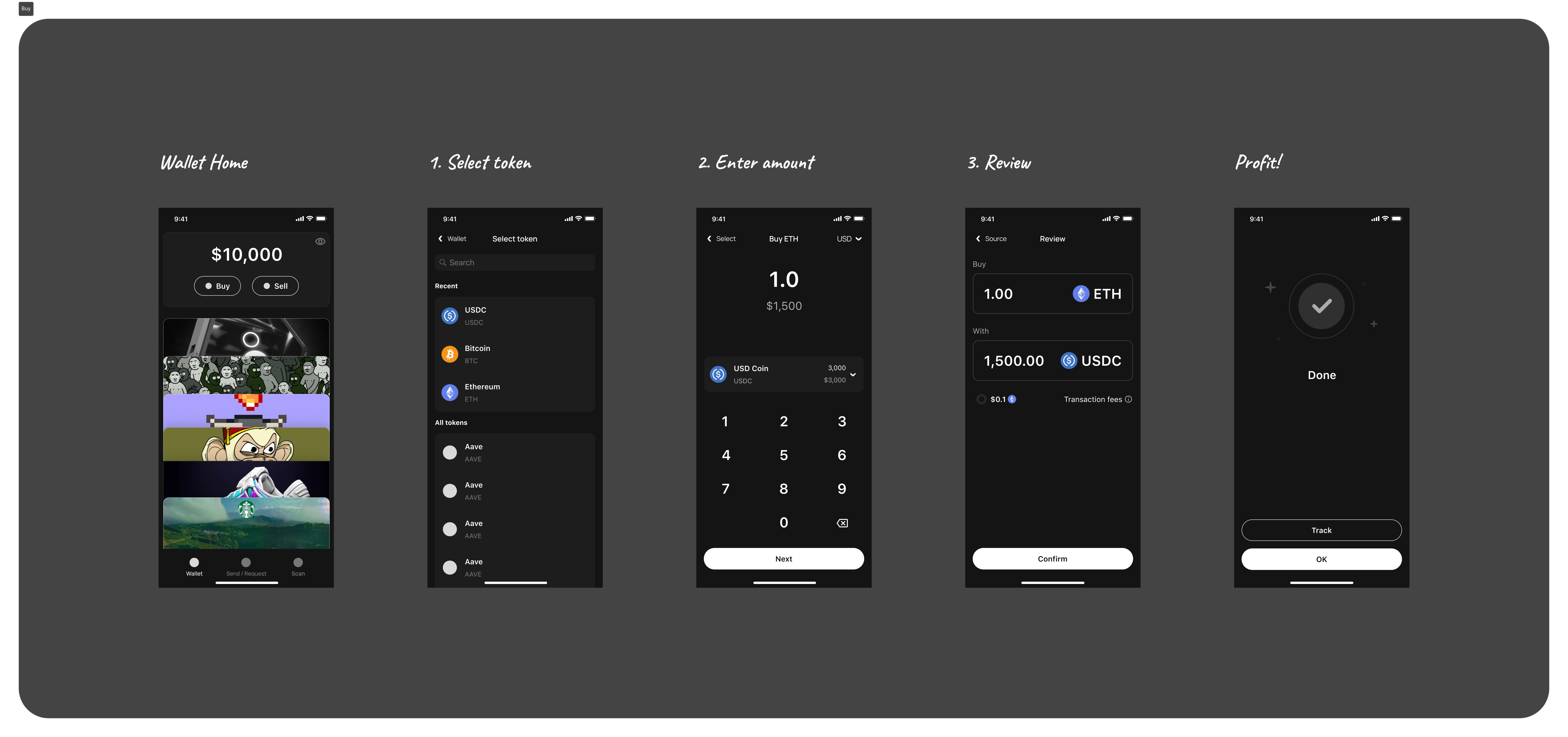
The main actions—buying and selling—should be straightforward. For example, to buy ETH:
-
Tap Buy.
-
Select ETH.
-
Enter the amount in your default currency (e.g., USD).
-
Confirm the transaction details, including fees.
-
Complete the purchase.
We've abstracted away network selection and simplified fees, eliminating the need for users to understand bridging or swapping. This could be powered by solutions like Li.Fi or, ideally, through chain abstraction.
Send & Request
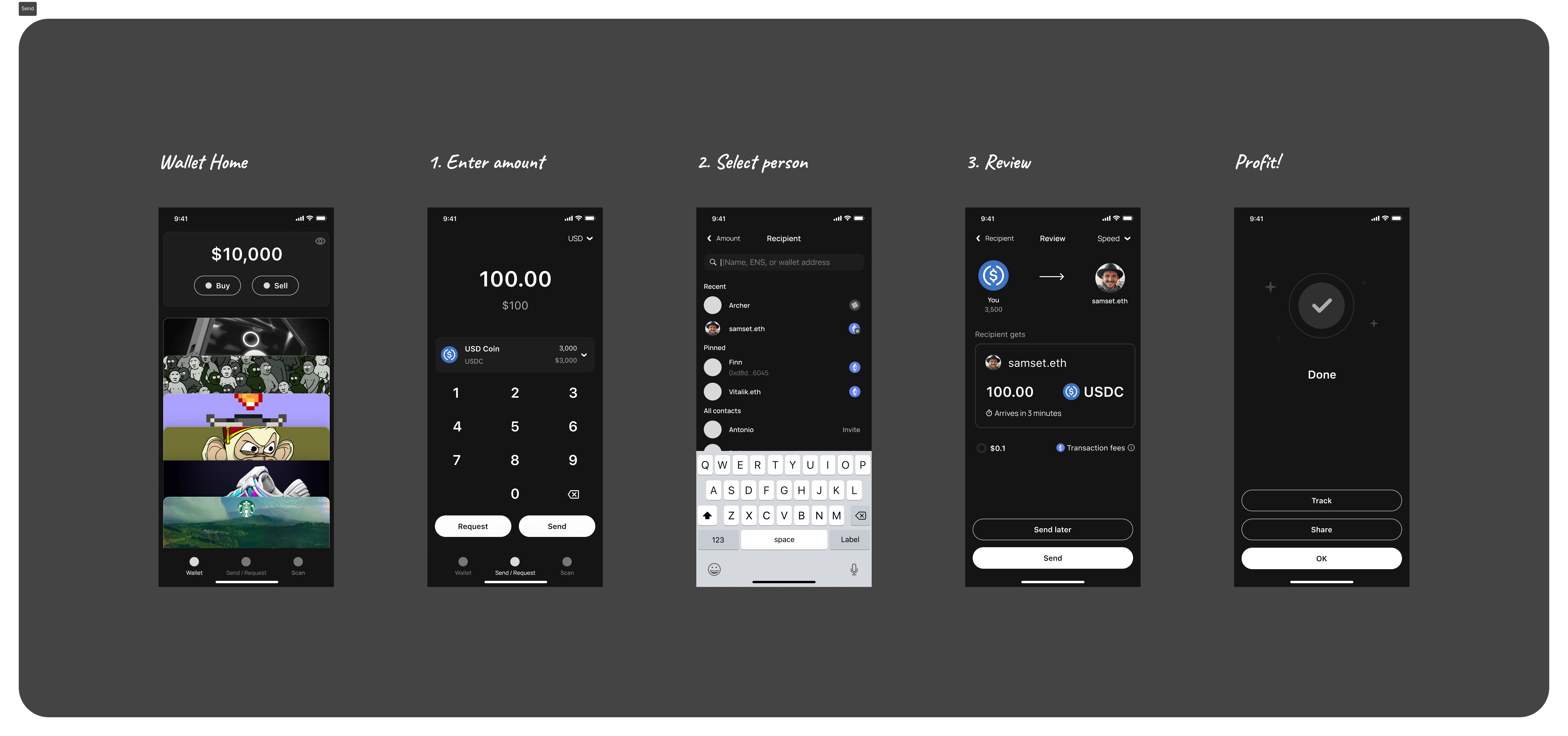
Sending
Sending funds should be simple:
-
Enter the amount.
-
Select the recipient via contacts, ENS names, or wallet addresses.
-
Review and confirm.
-
Send.
The cool thing here is that by avoiding verbose wallet addresses, and plugging in various identity systems and merging them with phone numbers, emails and usernames like ENS, you plug into an open loop system that allows you to send funds to anyone simply by knowing their handle. The handle translates to a wallet address in the background, and the mechanism of moving funds between the wallets (and networks) can be handled by chain abstraction.
It's important to unify steps to follow consistent design patterns and language. This reduces the learning curve for users.
Requesting
Requesting funds is a feature lacking in many wallets. The process should mirror familiar experiences like requesting money on PayPal:
-
Enter the amount.
-
Tap Request.
-
Select the person.
-
Confirm and send the request.
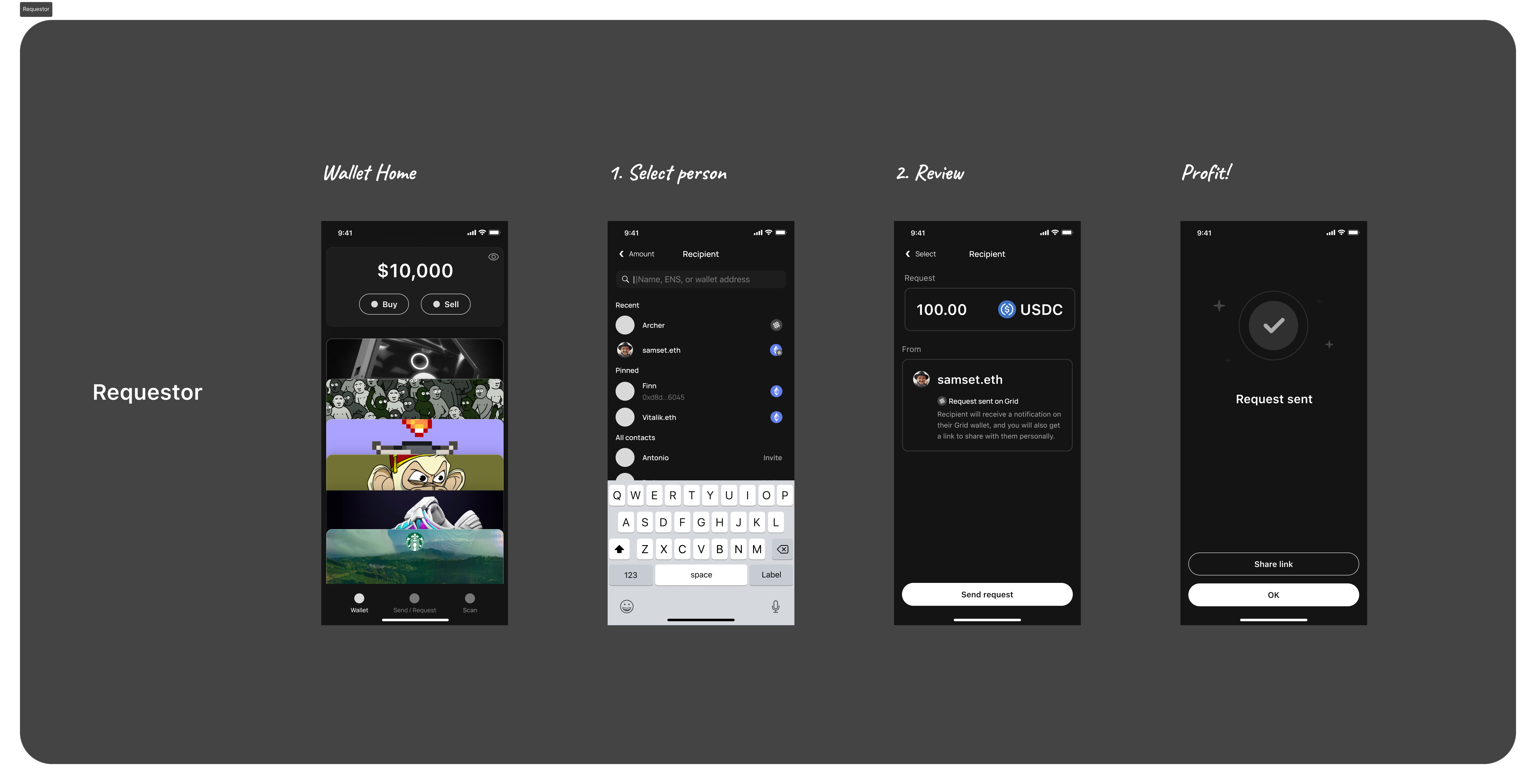
The recipient receives a notification and can easily fulfill the request:
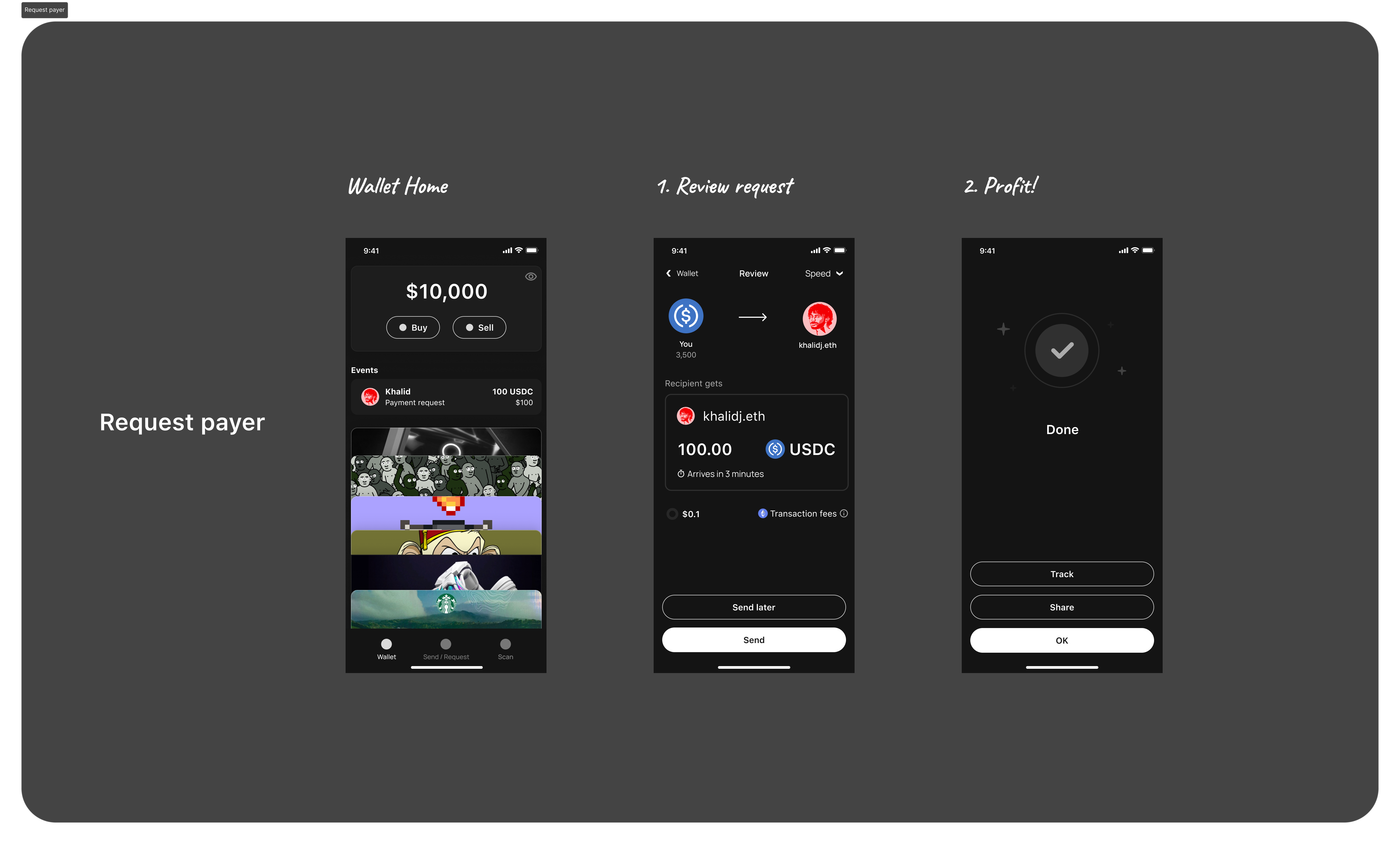
By leveraging common design patterns we are already familiar with, we reduce the learning curve and make the experience intuitive.
Other Considerations
These are just the tip of the iceberg; other features include:
-
Privacy options: Ability to hide balances.
-
QR code functionality: Universal QR code scanner and sharing capabilities.
-
Security measures: Smart contract wallet features like daily limits.
This isn't necessarily the perfect or most visually stunning wallet design. Design effectiveness ultimately depends on the target audience and goals. My aim is to provoke thought and promote the idea of a wallet that doesn't make users think. The underlying user experience is key.
But This Stuff Is Possible Now
Contrary to what some might believe, creating such a wallet is feasible today. While the best UX has been held back by infrastructure gaps, numerous companies and teams are making significant strides to bridge these gaps. Collaboration and holistic thinking are essential—we must move beyond traditional approaches and embrace new paradigms.
Account Abstraction and Modules
Account abstraction allows for more flexible wallet functionality. Modules can enable features like payment requests, distributed across wallets that support them, creating an open and decentralized ecosystem similar to closed-loop fintech apps but without restrictions. Shoutout to Rhinestone for pioneering in this area.
Magic Account
The Magic Account project exemplifies the combination of account and chain abstraction, offering a unified balance and passing the "Don't Make Me Think" test ✅. This architecture makes the unified balance concept feasible today.
Chain Abstraction
While still evolving, chain abstraction removes network complexities from the user experience. Key contributors include:
-
Paygrid (my startup focused on payment infrastructure)
-
And many others advancing this field
Also shout out to Coinbase Wallet (not the CEX app), for being one of the major mainstream wallets today that are embracing account abstraction, Magic Spend, and simplifying the technology for the average user.
Try the Prototype
Experience the design firsthand:
Walking the Walk
It's incredible to see the progress in Web3 infrastructure. Many are unaware of the wave of change brewing—a path leading to significant growth and adoption. Personally, I use crypto for everyday purchases, from groceries to online shopping. While some aspects have improved over time, like wallets, others—such as crypto checkouts—still lag behind.
This is why I co-founded Paygrid. We're tackling the technical challenges holding innovators from unlocking next generation payment UX by addressing the entire stack—from low level infrastructure to developer tools. We don't build end-user products; instead, we empower developers with specialized and open payment infrastructure to unlock a better future. By simplifying integration with intents, and solutions like chain abstraction, account abstraction modules and MEV protection in the dark forest, we aim to make seamless and safe payment experiences a reality across platforms—whether in a wallet, web app, or Shopify checkout.
The easier the infrastructure is to use, the more developers will adopt it, leading to greater innovation and better user experiences. Paying with crypto should be easier, cheaper, and faster than using a traditional card. Mark my words, this will happen.
If you've read this far, I urge you to consider the world you want to see. Find something you can improve, and take action. There's no shortage of ideas, problems to solve, or opportunities. We're entering the golden age of read-write-own. A billion-user adoption starts with us, the crypto natives. If we don't fully embrace and truly love what we’re using or making, we can't expect others to do so.
Get the Figma file
Feel free to use this prototype; attributions are appreciated. GitHub (Figma design files).
Thank you for reading. If this resonates with you, please share it and reach out with your thoughts.

评论 (0)